Defining an executable product strategy
What do other travelers think of properties on Expedia?
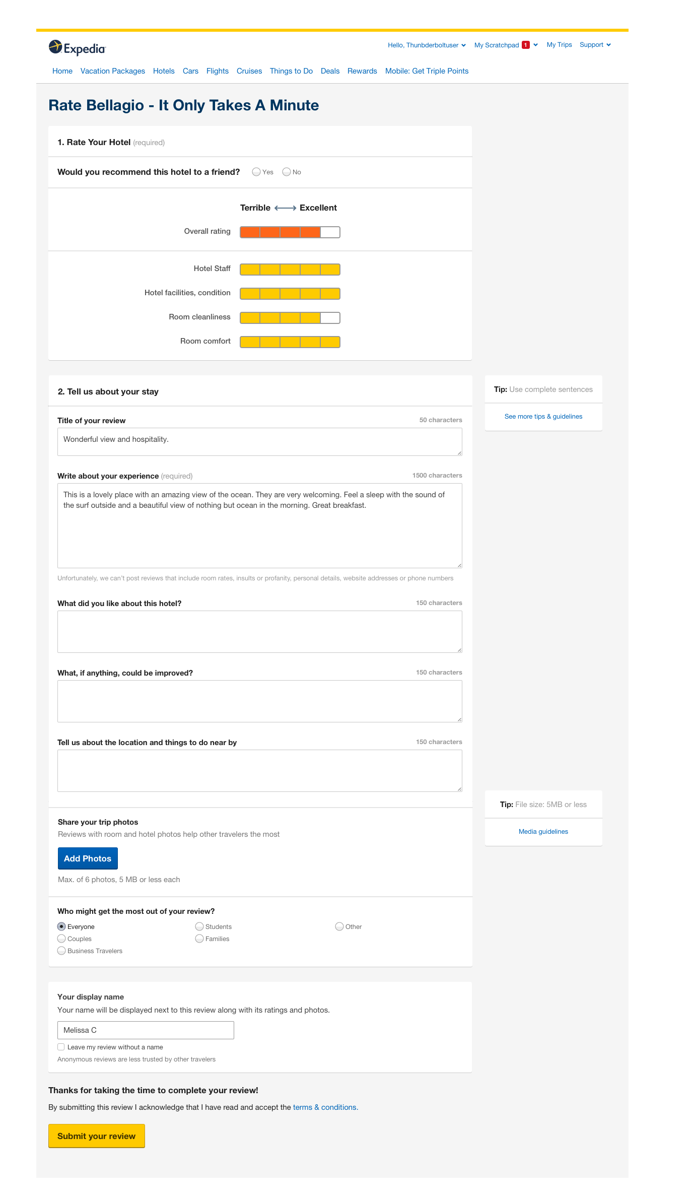
Our proposed updated post stay review form a user gets after they check out of a hotel.
Background
The only way Expedia collects user generated content today is from Real Time Reviews (short review forms sent after a user checks into their hotel or after a flight) and Post-Stay Review forms (sent after a user checks out of a hotel)
Due to a handful of re-orgs, updating the review form designs started several times but never launched. The last design put into production came from 2008. In the time since then, all of our competitors were making huge investments in collecting user generated data.
As brands Expedia has acquired have migrated to the Brand Expedia process and form they have seen significant drops in submission rates.
Brand Expedia post stay review response rate was 13% and declining year over year.
As Expedia expanded into adding information on different travel destinations, a competitive gap was having any content from real travelers.
user problem
In nearly every user study we run, users mention how important other traveler reviews are when deciding on which hotel to stay at.
User device data showed that users are more often coming to these review forms on their mobile device, but both forms were only optimized for desktop-sized viewports.
In interviews with frequent travelers on how they select a travel destination, 85% of users mentioned the need to read tips from other travelers on what made the destination worth seeing.
our goal
Define an executable product strategy for collecting user generated content from our review forms
Be able to hand off final content and visual designs within 2 weeks of getting buy in on the product strategy
My role
I was both the UX lead and primarily responsible for competitor analysis and any ixd work, though it was a collaborative team of 3. I helped with visuals, mainly error states and accessibility, but another designer was responsible for much of the polishing work.
Skills Used
interaction design
user research
storytelling
content strategy
project management
OUR PROCESS
Document all the known problems
Because this was such a broken problem space it was helpful for us to begin our process by documenting all of the problems into one giant list. After we did that, we were able to quickly identify three higher level areas that needed help:
Asking the right questions
Asking the questions the right way
Asking these questions at the right time
With these areas in mind we studied competitors and did our best to reverse engineer their product thinking. Our favorites were Google, Airbnb, Booking, and Tripadvisor, but we looked at several others.
The old review form. This is how it looked for desktop AND mobile.
Documenting all of the known problems with our UGC collection forms.
The review form was not the same for every users. Some higher rewards tiers had different questions.
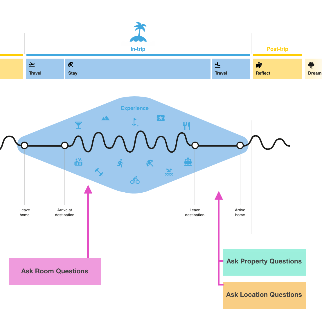
2. leverage what we know about the traveler journey
While doing this, we also utilized our traveler journey to document all the questions we know most users ask throughout.
Once both tasks were completed we were able to combine competitor themes with our traveler research to define what types of content we needed to ask about and identified where in the traveler journey it would be easiest to collect it.
This set us up with an easy to understand, user research support product strategy.
This was our high level strategy that incorporated all of our research and competitor analysis.
3. get all stakeholders on board
Next, it was time to get all our stakeholders on board.
We created some concept designs of the updated review forms to show “what good looks like”. We were able to incorporate improvements to many of the document problems, but our focus to start was to ask the right questions. We chose this as our first priority because without getting the right content back, the entire product loop could not work. (If the current collected content wasn’t answering a traveler question, why would any product team want to play it back on the site?) In addition to the concept design, we documented how to get there by a list of immediately actionable next steps. We used the animated prototype to get people excited, and then showed them the road to get us there.
While these next steps were being worked on, we polished the UI design and the content strings
4. Hand off Final screens and content
Ultimately we handed off MVP designs with update content and an updated visual look and feel. To get to production faster and to reduce the number of changes in the first A/B test, engineering prioritized building the new design with the old questions first - and moving on to the new questions (with the new design, assuming it won), second.
5. Wait for results
Our first test with the real time reviews yielded a +33% submission rate winner.
Our revised post stay review email - currently the only way to get to the review form - yielded a 12% submission rate increase
Our first test with the post stay review form (new design, same questions) - yielded a 33% increase in submission rate
6. iterate
As of September 2018 we are actively testing a new iteration that asks more destination questions. If you book a hotel on Expedia, you’ll be able to see! I’ll update this when we have more metrics and learnings :)
looking back
what went well
Since this product was so overdue for an update I know the metrics aren’t as fabulous as they look. However, this was truly a UX-led project and it is my favorite example of “design for the user, all else will follow”.
I saw my influencing skills grow significantly during this project because I was so passionate about getting this new form right now that we were finally going to update it. I was extremely motivated to not be another team that “Started to work on it, but then it got de-prioritized”
where we could improve
We faced a lot of scope creep during this project and we went off the rails at times. When we initially presented our suggested next steps for executing on this strategy, product wanted to put it on hold and go after something totally new. It took a lot of influencing up until the first tests rolled out to make sure this didn’t get shelved again without UX knowing.
I wished we had done some usability testing prior to rolling out. Fortunately we were able to do this afterwards, but there were some really easy low hanging fruit UI improvements that would have been helpful to incorporated from day 1 of the launch.


