Differentiating Properties on expedia
How can we help travelers find the right property while helping property owners understand why good content matters?
Mapping key traveler questions to the content on our property details pages.
My role
I was the sole lead UX designer working with a content strategist.
Skills Used
competitor tear downs
interaction design
information architecture
visual design
product strategy
User problem
Based on today’s Expedia.com experience a user cannot easily tell the difference between properties.
Supplier problem
Property managers want to stand out in a crowded marketplace and help travelers understand their property’s experience, especially what makes it different.
Today a user struggles with being able to easily compare properties on our search results page.
On a property’s details page it also is not easy to understand how this property compares to others.
Business opportunity
Help travelers find relevant content that answers questions about property fit while helping suppliers understand why providing good content about their property matters.
our process
Collect user research
Define core property content
Create a framework
Use the framework in a concept design
Test and iterate
Step 1. Collect user research
Because we were working on a two-sided problem with teams that are usually only thinking about one of the sides, I really wanted to make sure the story of each user was clear and relatable. I made personas to help me do this, which were backed by 100% of validated user research.
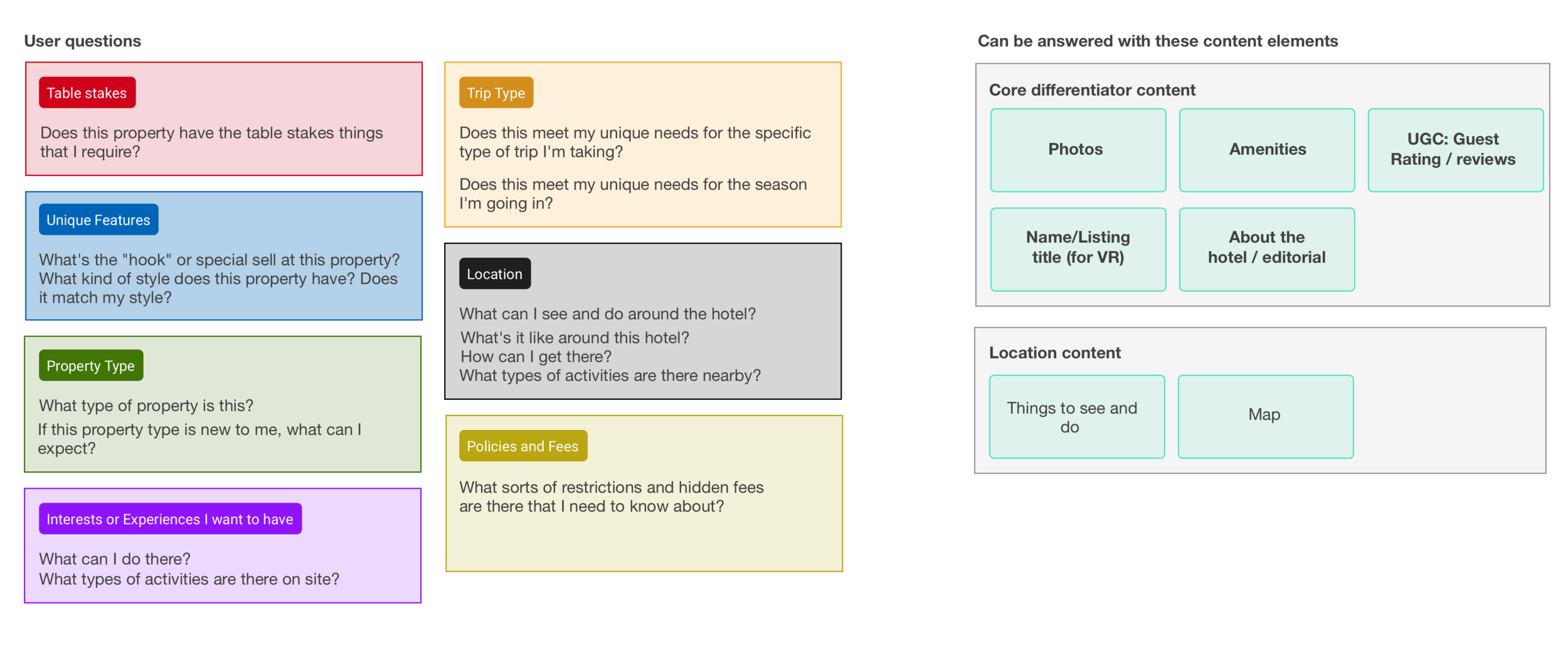
I also took a look at our traveler journey maps and documented all the questions have related to property fit. It was useful to put these into themes to see what types of questions a user would have.
Step 2. Define core property content
I evaluated the content competitors were using on their equivalent property details pages and started to identify what the core content was. It was helpful to see where in the hierarchy each competitor put this content as well as how they visually presented the content in their attempt to help users understand the property’s fit and what made the property unique. I also audited out current IA and content types. All of this information allowed me to come up with the following core content used to differentiate properties:
Photos
Amenities
Guest Ratings/Reviews
Editorial description
Name/Listing title (for vacation rentals)
Location content (nearby things to see and do)
Step 3. Create a framework
With a perspective on the problem space and an idea of what content was important to the solution I put together a framework that could solve traveler’s top questions about traveler fit by utilizing the core property content I had identified.
Step 4. Use the framework in a concept design
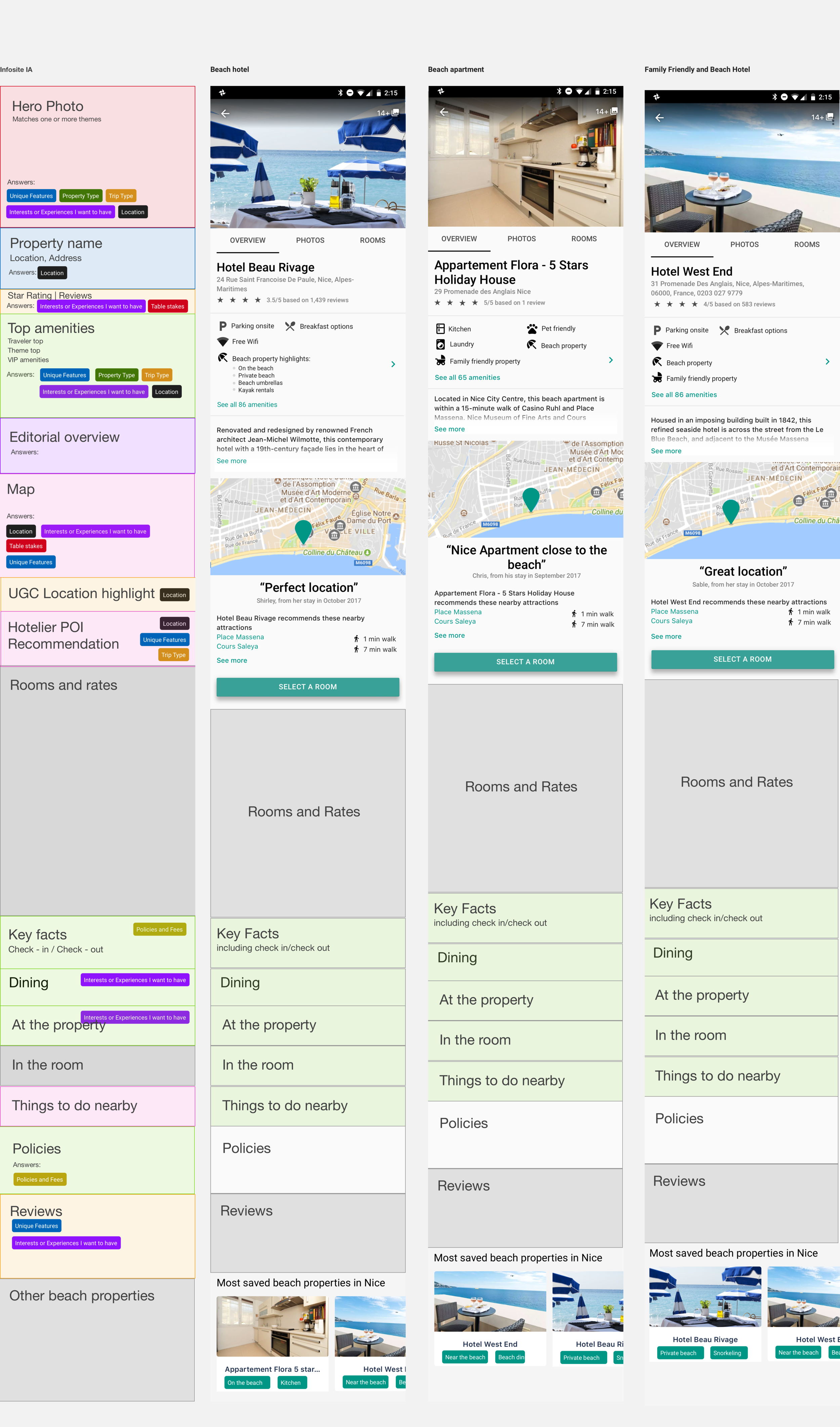
I always find it helpful to show what a framework looks like in practice (aka with visuals) so I made a brand-agnostic prototype highlighting how the framework can help properties be distinguishable from one another. The brand-agnostic choice was intentional as I was sharing this framework with both Expedia.com and Hotels.com.
Step 5. Test and iterate
After socializing this with related stakeholders we made a team decision to utilize the framework and focus first on improving photos since they are arguably the most compelling piece of property content and are often the most engaged content component on our site.
TEST 1
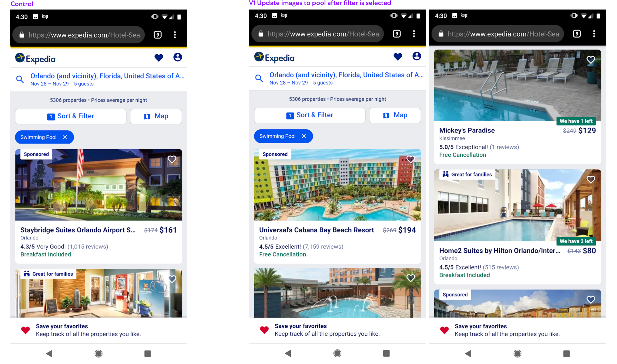
Changing the photo to a pool when a user interacted with it was a 1.2% increase in conversion +/- 0.5% probability. It has been rolled out 100% to production since.
TEST 2
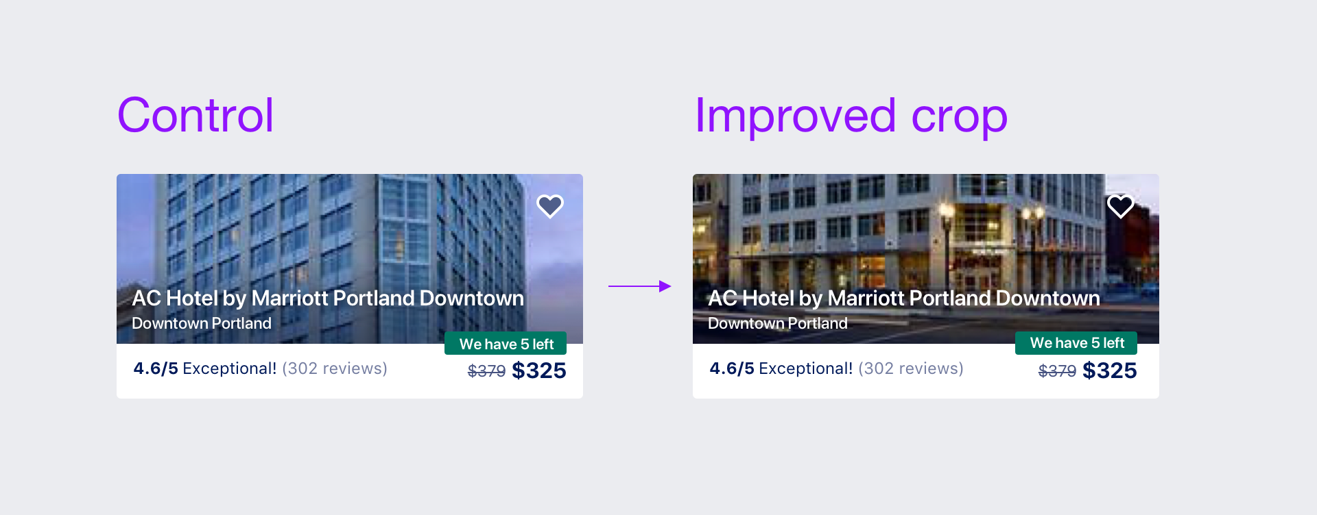
For our second test we worked with engineering to improve the focal point and crop of all property photos that appear on our search result pages. This was a 0.9% conversion increase +/- 0.5% probability and has been rolled out 100% to production.
TEST 3
We then took the improved cropping and tested different variants of designs against it. While conversion as neutral across all variants, V1 and V2 saw increases in click through rate, thus getting users further down the funnel. For this reason, we rolled out V3 which was UX’s preferred variant. I like this design because while large, it allows us to do the best job of telling the story of a property search result listing.
TEST 4
While we were working on the traveler-facing tests, we also tested a discovery card for our property owners. Discovery cards are actionable insight snippets property owners see when they log into our internal supply tool. If a property owner indicated that they were a beach property, family friendly, and/or good for business travelers (our priority themes at the time), we asked them to provide photos of related amenities that they said they had. This discovery card helped boost a 12% increase in photo additions which ultimately boosted the traveler shopping experience.


