Expedia’s Reward Program
What does it mean to be a part of expedia+?

My role
I worked closely with the UX lead, Product owner, and content strategist for this work. Everyone was involved in ideation after which I lead the exploration and finalization of visual assets.
Skills Used
interaction design
visual design
information architecture
annotated wireframes
User problem
The Expedia rewards program relaunched in 2014 as Expedia+ with a variety of new benefits. A user research survey in early 2015 showed that 80+% of our new members didn't know their status or understand their unique set of benefits (both the opportunities and limitations).
Sadly, even silver (second-tier) members only had 50% awareness that they had achieved their elite state or what it meant for them.
Our initial "How it Works" page was causing from a shocking 21.55% bounce rate. This page was a centerpiece of the Expedia+ launch and featured an immersive, high-touch parallax scrolling experience interposing aspirational imagery and program details. It served as the welcome mat for and primary means for customers looking to understand the program--and it was struggling.
Improvement #1: Fix the “How it works” page
We chose to find some “quick” wins with the how it works page to improve bounce rate. Everyone on the team was familiar with the page and had strong opinions on what wasn’t working, so we held a 3 hour brainstorm/sketch session with all disciplines involved - product, content strategy, visual, and ixd. Everyone sketched solutions that could be implemented to help with the how it works page.
We Came out of the meeting with an agreed up design and myself and the visual design made the specs, handing off to the devs by the end of the day.
Results: These changes resulted in a +13.3% increase in acquisitions and 74.8% reduction in abandons from that page. Annualized, these improvements account for +$1.5M in gross profit. See the live page here.
Final comps

Improvement #2: Creation of rewards Tier pages
A longer term vision to help address user’s lack of awareness for the rewards program and what it involved led us to creating three stand alone pages -one for each specific tier of the program (Blue, Silver, or Gold). When a user clicked on the tier page they’d be taken to the page that corresponds to their current tier.
We brainstormed and ideated on the best way to do this and internally user tested as we iterated to make sure the pages were clear.
Results: When the new tier pages launched we saw not only an increase in conversion but also increased engagement rates for both new and established users compared to users’ . See the live pages: Blue, Silver, and Gold.
Brainstorming
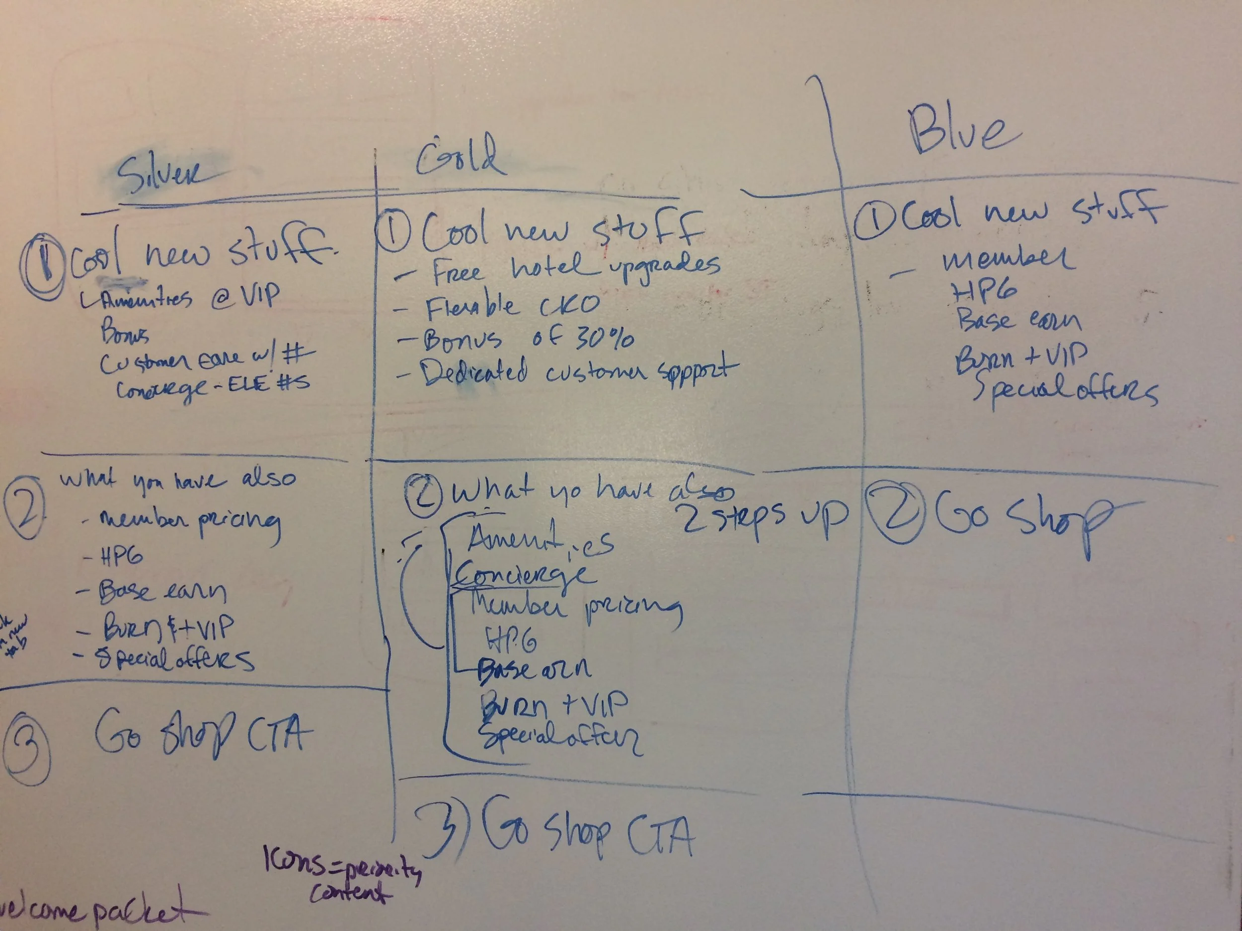
Our initial sketches for the Tier pages were content first.
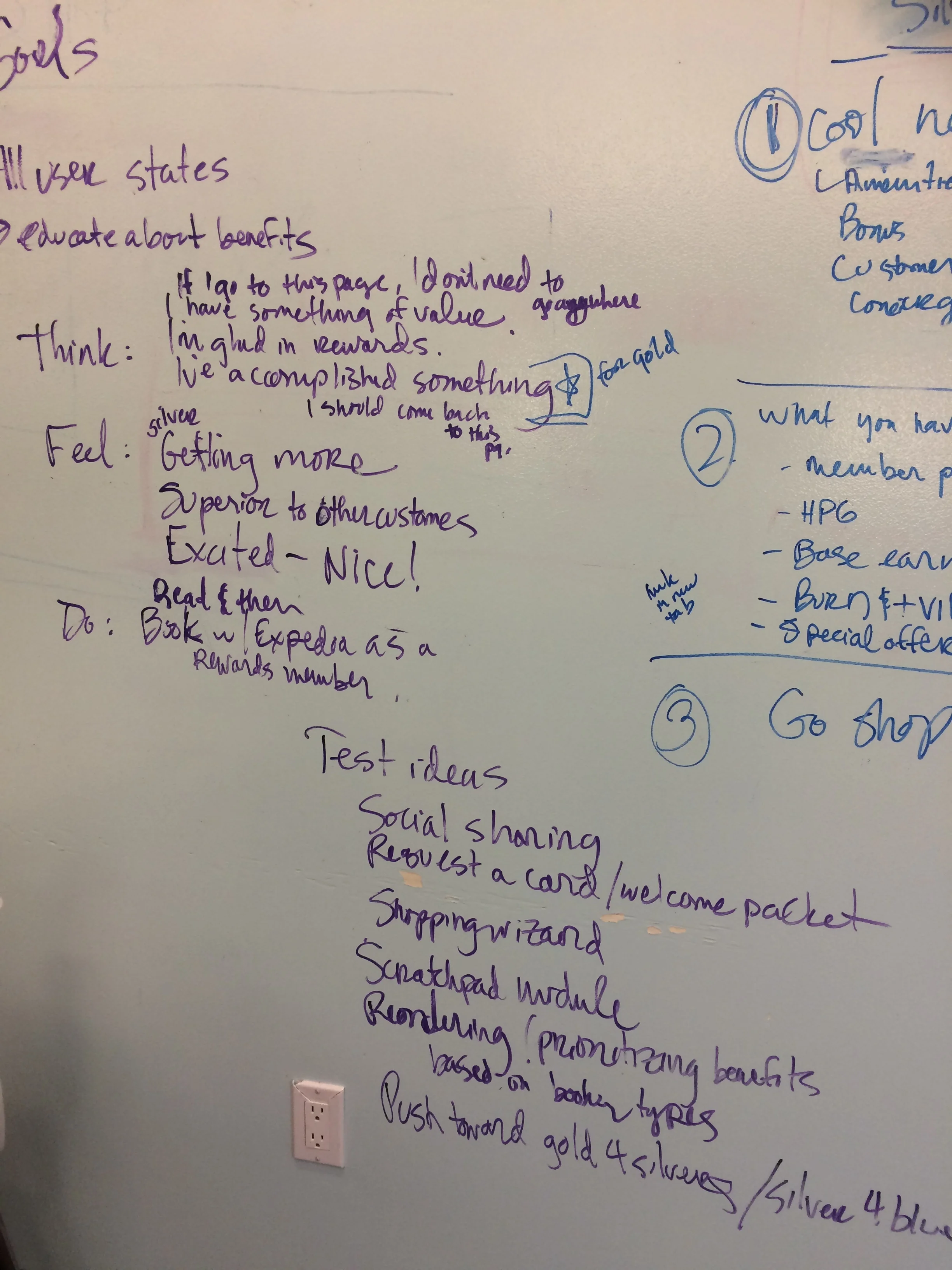
An exercise we like to do called “Think/Feel/Do” helps set up the story our eventual design will try to tell.
Final comps

Our responsive tier pages. From left to right: Blue, Silver, and Gold.

Our responsive design on desktop. This example is the Gold page.
Looking back
what went well
Spending a few hours and getting a better user experience out the door the same day was fun and successful. I always enjoy when every skillset can be involved in designing because we are ALL designers.
This was at a time when designing mobile first was still new to the company and we had nothing but encouragement to design the new pages this way - which was wonderful as we had more time to have discussions about other design aspects.
Where we could improve
The loyalty product at Expedia is a tricky one because the benefits themselves are not straightforward and an easy hook. This made it challenging to explain to users what benefits they have and why they should care.
While I am happy we were able to find space to tell the full story, I constantly think of the phrase “meet the user where they are” and by making stand alone pages - we went against that.