Creating Expedia Pulse
How can we help travelers daydream about travel?
Expedia had conducted qualitative research that suggested users are thinking about travel more than we might think. Many people tend to always have their next trip in mind, even while on a current trip. Expedia.com, however, currently doesn’t offer a way to help users unless they give us an idea of where they are thinking. Could we build something that could change that and marry those two observations? My team went out in the wild and looked for existing product architectures around live data & personal relevance. We spent 4 months testing over 6 different prototypes in our in-house usability lab using electromyography software to track customer delight. Each set of lab results influenced our iterations and ultimately we were able to prove that there’s delight to be found in the travel planning process.
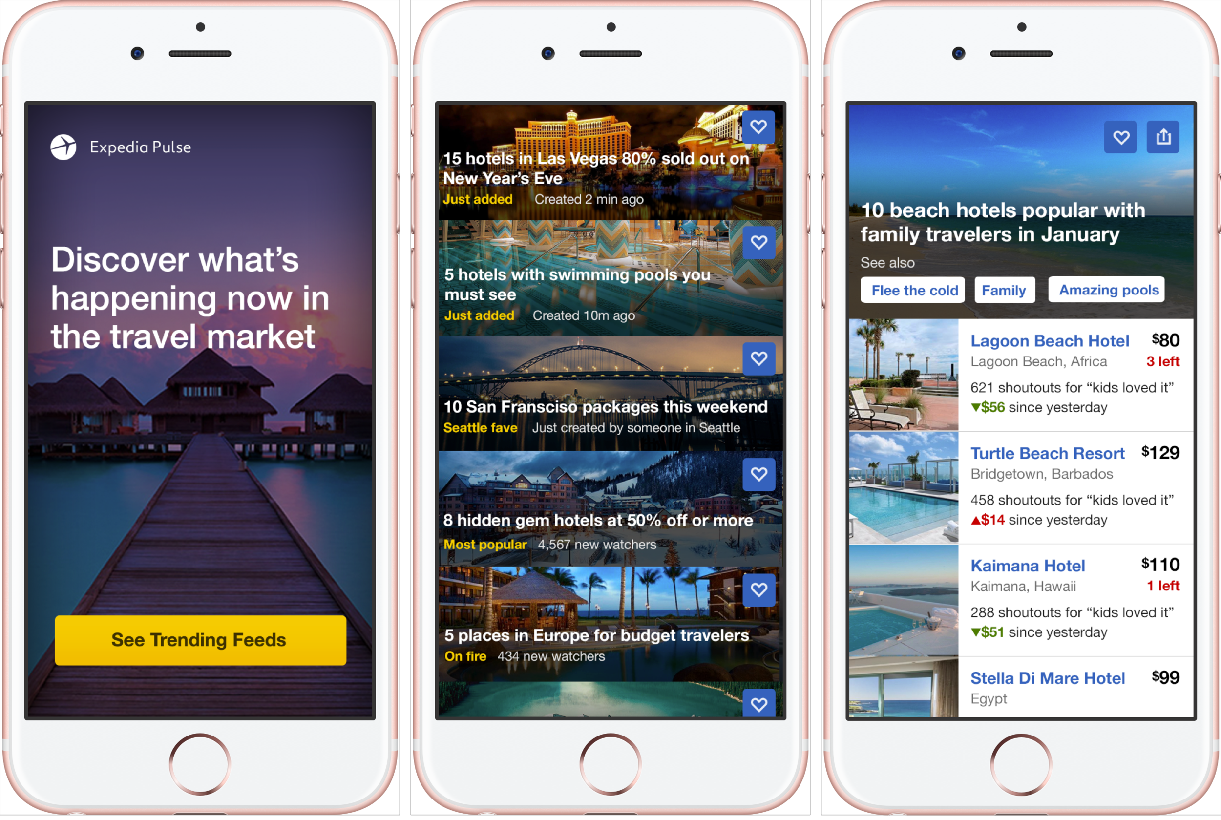
A sneak peak at the final iteration of our app.
User problem/finding
Users tend to daydream about travel far in advance of actually planning a trip. Most users are even thinking about their next trip while they are on their current one!
Expedias opportunity
Unless users know where they want to go and when, but current expedia.com site at the time could not help them. Could we build something that could change that?
Project goals
Allow users to browse travel trends
Allow users to be inspired by new places to travel
Have users enjoy their experience
Out of scope
Getting users to purchase anything
Any interaction with the current expedia.com site
My role
I was the lead ixd and visual designer. In the beginning we had an extra, awesome visual designer who moved to a different project after we ran our first test. I was responsible for the creation for most assets and on hand during all user studies to update the prototypes in between user sessions.
Skills Used
interaction design
visual design
prototyping (various fidelities)
sketching
ideating
user testing
project management
OUR PROCESS
Ideation
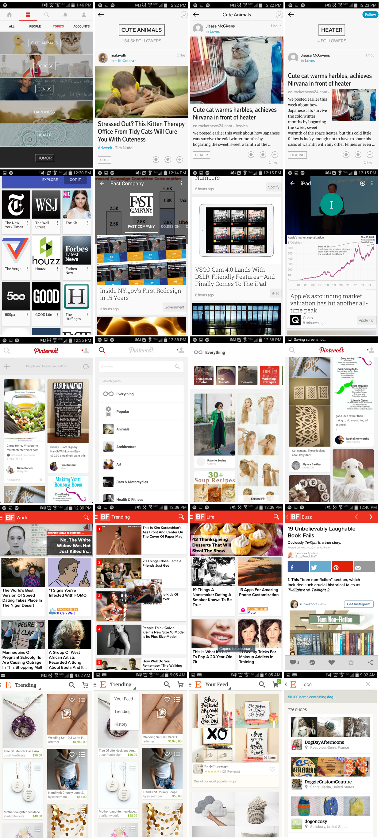
We started with competitive analysis - we went out in the wild and looked for existing product architectures around live data & personal relevance. Once we had some inspiration from so we started to sketch. A lot.
Some of the initial competitors we studied. Remember when these apps looked like this? ;)
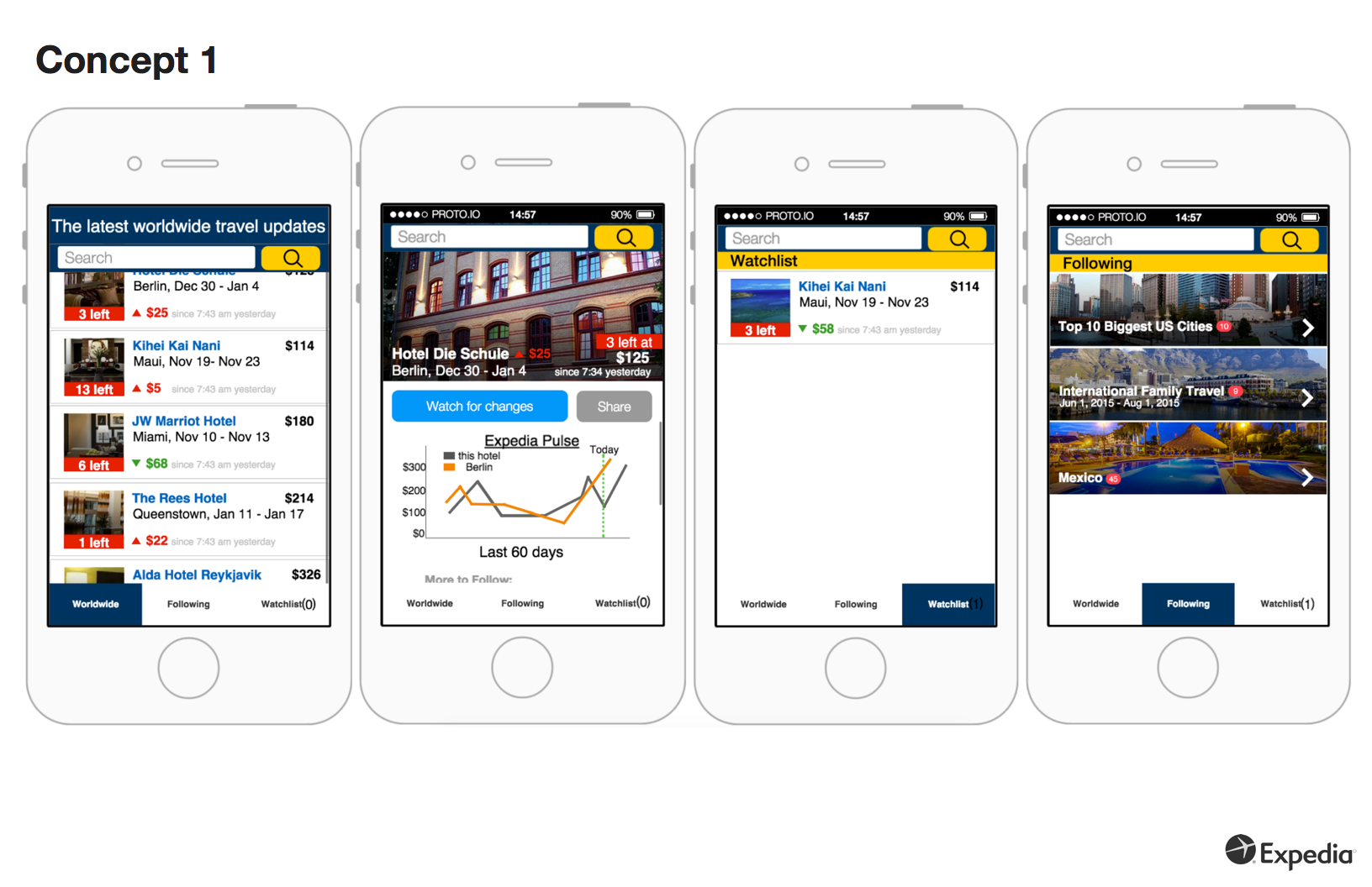
First lab test - 3 concepts
After ideating, we came up with 3 different concepts that we built into lo-fi prototypes:
Concept 1 was a 1:1 comparison to a stock market app - there’s one feed, users need to watch what they are interested in.
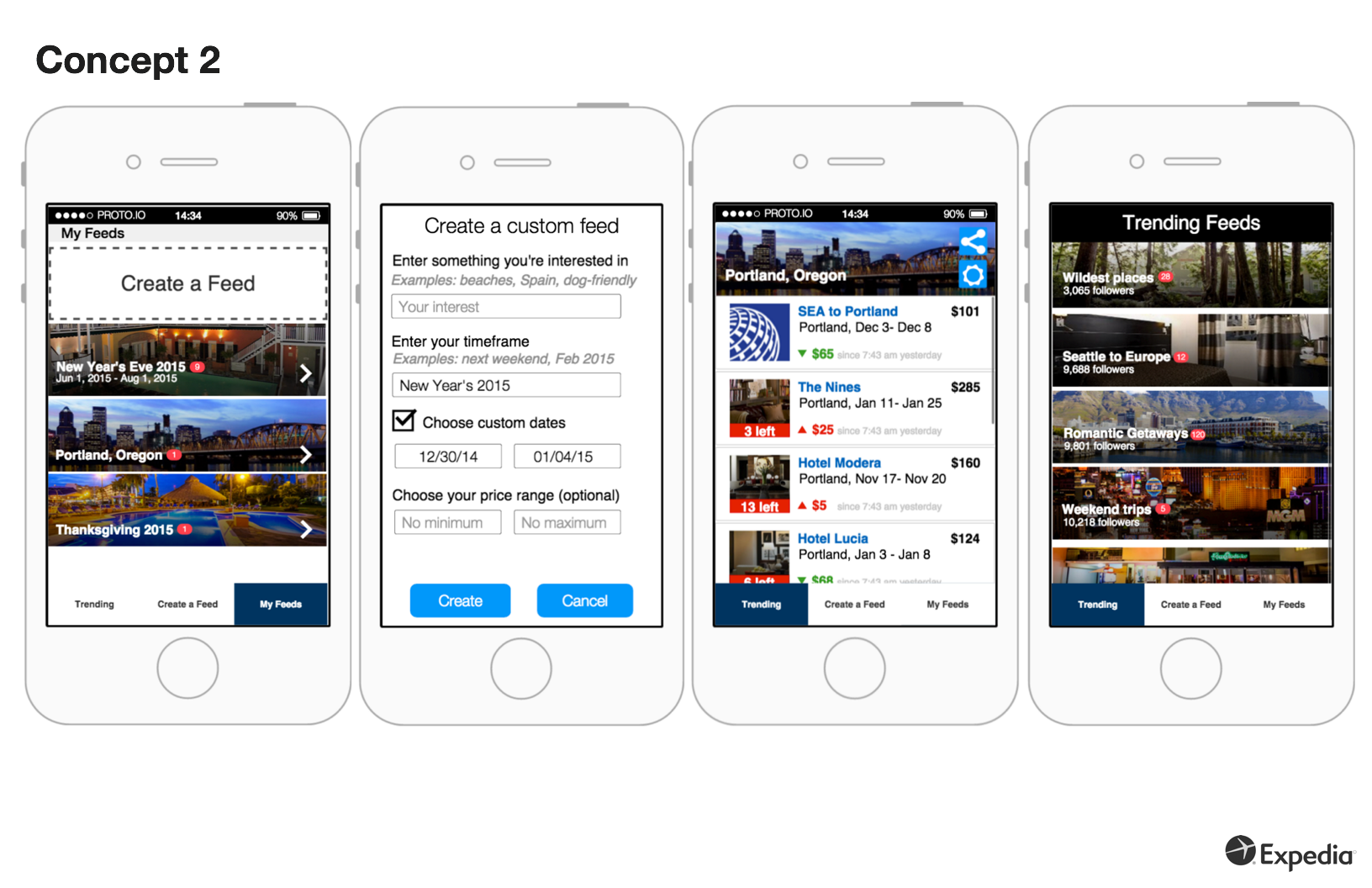
Concept 2 was about the user providing information to customize the feeds they care about. We’d also share overall trending feeds as inspiration
Concept 3 was a very simple “Let us find the deals and bring them to you” idea - one deal at a time. Similar to a news channel such as CNN or ESPN - they choose to share one story they think their audience will care about, but keep a ticker of headlines streaming on the bottom of the screen at all times.
We took these three concepts and tested them in our in-house user research lab. Participants were hooked up to Electromyography(EMG) software to track delight and frustration when interacting with each app.
Facial EMG (Electromyography) is a technique that measures changes in the facial muscle fibers that elicit tension/frustration and delight over time.
Additional Competitive Analysis on Concept #2
Our user research results showed that concept 2 produced 11 instance of delight across 6 participants. Concepts 1 and 3, while revealing in their own individual ways, produced no delight. As a result we chose to iterate on and reduce our scope to Concept #2 only. Before we started a new iteration, we took a step back and reviewed it was about and what users responded well to. This included:
Showing real-time feeds that were trending, allowing users to make specific feeds to watch
Providing change data on the travel market
Allowing users to discover new places to go and inspire future travel - allowing them to day dream
Afterwards, we asked ourselves: What are current apps doing today that have similar features to this concept?
News apps aim to provide users with real-time news on interests they care about. Pinterest, Buzzfeed, and Momondo.com also have components similar to Empty Closet. So we studied these, and many more.
Updated Empty Closet - 3 iterations
With another round of competitive analysis complete, we made updates to concept 2 and brought it back into the lab. This process repeated itself several times. With each update we increased fidelity, incorporated results from lab studies, studied in the wild design patterns, and met with stakeholders for feedback
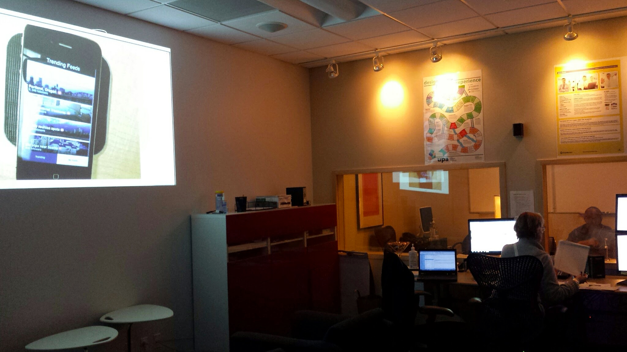
We used Electromyography (EMG) software in the lab to track users' delight and frustrations throughout the experience. This is the view from behind the glass! I spent so many hours in here during this 4 month period.


Final deliverable and results
After 4 months, we successfully presented our findings and the latest prototype to internal stakeholders. Successful concepts of the story have been applied and tested all over the Expedia at an ongoing basis.
Users are now able to favorite our travel products and destination material on the site.
Some of my favorite examples:
Destination pages. See a live one here.
Favoriting content on the site
Traveler-backed meta data on property and destination content
Traveler backed meta data supports content throughout our site and was influenced by the Expedia Pulse work we did.
Before Expedia Pulse, destinations pages did not exist on Expedia. We now have pages for every city and neighborhood.
Looking back
what went well
Not limiting ourselves to travel sites for competitive analysis - there’s inspiration and design patterns to follow everywhere
Restricting ourselves to mobile - this allowed us to keep our concepts focused on important details
Using appropriate prototype fidelity- we kept fidelity low until we could get user results, then increased the fidelity while iterating
Following the delight - listening to our users led us to success - quickly!
Starting with an open perspective focused on the problem (instead of the technology), gradually narrowing down to what is technically possible leveraging in-house tools
Using real data - realistic price changes, hotel photos, and names
Animating our work, no matter the fidelity - making it feel “alive” was important for people to get a feel for it
where we could improve
Staying focus on the concept- it was hard at times to know what to flesh out and what to keep out of the design when iterating. We had to constantly ask ourselves: Is this component critical for the user to understand our concept? If the answer was no, we didn’t design it.
Content - word choices are critical. Many times we swapped labels or headlines in between user sessions
Onboarding - we learned this is hard to get right, and ultimately needed to be a concept studied on it’s own, but we also needed users to understand what we were showing them
Time - there’s never enough :)
