BLUE BEAR SCHOOL OF MUSIC UI AUDIT
What opportunities exist to enhance and improve the user experience?

Homepage for Blue Bear School of Music
To combat recent weakness in enrollment and to prepare for creating a mobile version of their website, Blue Bear needed to make sure their website is functioning at a very high level. Working with their leadership team I was able to do an overall UI website assessment that included a variety of user research, prototyping, and usability testing, before presenting a set of recommendations.
MY ROLE:
I worked as a solo UXer on this one
SKILLS USED:
Project management
User interviews
Usability testing
Prototyping
Information architecture
MY CLIENT & PROJECT PURPOSE
Blue Bear School of Music's nonprofit mission is to provide superior quality and affordable popular music education to aspiring musicians of all ages and skill levels within a supportive and encouraging community, and to provide music education to communities that don't have access to arts programming.
The purpose of the UI Evaluation was to do the following:
Assess existing Blue Bear website User Interface
Research social media icon and ideal placement
Research instant access feature design and ideal placement
High Level Process
The following process was followed for the UI Evaluation:
Perform user research
Determine what is working well and what opportunities exist
Perform usability testing
Prototype changes
Perform usability testing on changes
Compare results
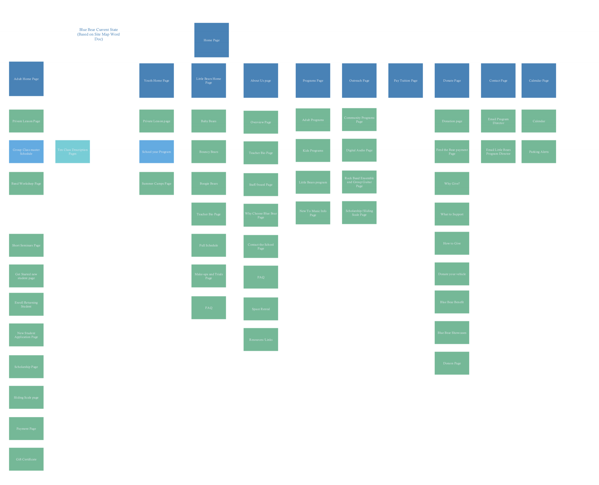
One of the first things I did was create a site map to understand how everything was currently connected.
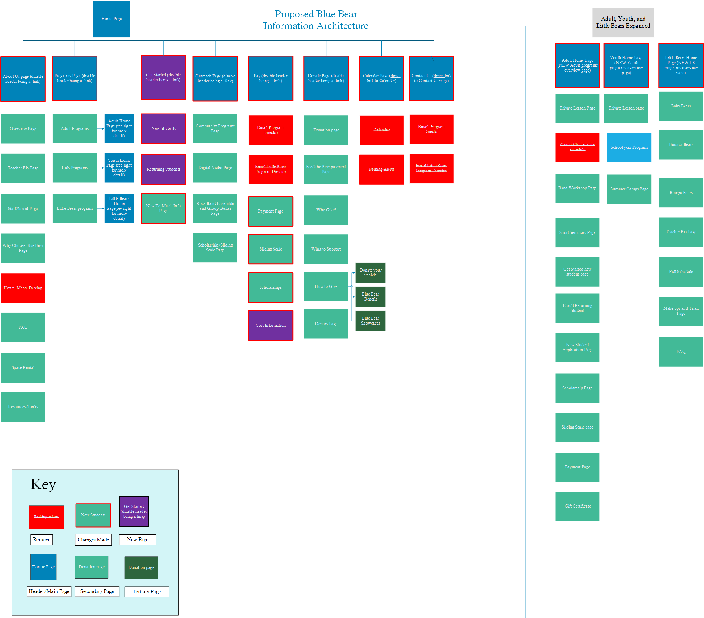
The updated site IA I delivered to the client.
User research
INTERVIEWS
Interviews were conducted with 3 current adult music program members to get an understanding of how they use the current site, what works well for them, and what opportunity areas they thought existed.
SITE SURVEY
A general site survey was conducted to get an idea of reasons what type of users come to the site, what types of tasks they visit the site for, and provide an opportunity to give any feedback. Heuristics Evaluation A heuristic evaluation was performed as a way to find usability problems in the current user interface design so that they can be attended to as part of an iterative design process. Nielson’s ten usability principles were referenced in this exercise.
PRELIMINARY CARD SORT
Card Sorting is a technique that was used to explore how people group items so that we can develop structures that maximize the probability of users being able to find items. The preliminary card sort leveraged the site map data of the existing site.
PRELIMINARY USABILITY TESTING
Four users performed usability testing on the current Blue Bear website. The goals of usability testing included how users were using the site for common tasks and identifying pain points to improve the usability and end-user satisfaction. Each participant went through the same set of tasks, ranking each one on how easy it was as well as how confident they were that they completed the task.
CRAZY EGG DATA
Crazy Egg is a tool that tracks where users are clicking on a page, as well as what parts of a page are most viewed. This tool was set up on the top ten pages (per Google Analytics) and provided data to support suggestions on site improvements.
GOOGLE ANALYTICS DATA
Google Analytics data was utilized to understand what pages are most important to users and to better understand their behavior, such as user navigation throughout the site.
CARD SORT II
The new card sort is based off the prototyped revised site navigation. Paired with user testing, this helped validate that the new navigation is more in line with where a user expects to find certain content on the site. This data is provided in the supplemental reference documentation.
USABILITY TESTING II
The second round of usability testing tested the prototyped changes. Users were asked how confident they are after each tasks as well as how easy each task was - similar to the first round. This allowed results between both rounds of usability testing to be compared.

Results of the second round of usability testing with UI improvements saw great results!
FINDINGS AND RECOMMENDATIONS
I presented a set of findings and an overall report detailing the work I had done and suggested changes. See the report here.
A shorter version of the findings are below.
POSITIVE FINDINGS
1. Survey feedback indicated that users feel the site is looking better than it used to be.
“It's much easier than it was before ” - survey
2. Blue Bear website users felt pertinent information exists on the website
3. Blue Bear website users appreciated how quickly updates are made to the site
OPPORTUNITY AREAS
1. Payment process is not easy or well understood
“Payments are still clumsy.” - survey
"I don't know what I am even paying for" - P3, usability testing
"I don't know where to go from here" - P1, usability testing
Recommendations
Provide a quick high level sign up process for users
Allow users to select what they are trying to pay for and have form auto-populate
Allow users to find more cost information easily
2. Site contains a lot of content - it is not always clear to users how it all works together.
“There are duplicate, but not connected ways to get to information.” - survey
“The site has the right content but not structure” - Interview
Recommendations
Perform site inventory
Make footer consistent across all pages
Provide clear directions on how to sign up for a class
3. Site navigation research suggests changes to current site navigation
“‘New to music?’ is what I'd expect but I found it by chance.” - P3, usability testing
"Footer is overwhelming" - P2, usability testing
Recommendations
Revise navigation to “Revised Site Map”
Consolidate “Hours, Maps, and Parking” with “Contact Us”

CrazyEgg data confirmed my hypothesis that users were trying to click on the images on the home screen. Having data to support my recommendation to change this helped strengthen my recommendation.
FINAL DELIVERABLES & NEXT STEPS
FINAL DELIVERABLES
Prototype of suggested interactive changes
Revised Information Architecture
Blue Bear UI Evaluation Report, inclusive of all user research
Redlines for the developer to understand opportunity areas
Social Media Icon and Instant Access Feature research findings and suggested placement
Blue Bear incorporated a significant number of my recommendations within 6 months of my report. View their live site here.