Launching Amazon Clarity
How can we help operational leaders make more informed decisions with people data?
My role
I was the sole lead UX designer working with a product manager, technical product manager, and three engineers.
Skills Used
user interviews
usability testing
product strategy
interaction design
information architecture
Background
My team, PeopleInsight (PI), set out to be the single source of truth for people data across Amazon Worldwide Operations. After spending two years standardizing over 500 people metrics, the team was ready to turn data into products in ways that would allow Amazon operational leaders to make more data-driven decisions.
User problem
Operational leaders worldwide access people data everyday for all sorts of reasons. Site leaders, HR, Finance, and operation managers all have a need for them. Prior to Clarity, data was scattered across multiple reports - based on my data it would take 2-10 sources to gather everything they need to deep dive. In some cases, they'd also have to rely on HR for some data as it was restricted to a third party analytical tool that had an expensive license - so only 1 person per site had access. When they do finally have all the data they want, I learned from site visits everyone has their own way of formatting the data to get what they want. However, given the disparate data sources, users had a hard time knowing how accurate their insights were and what exactly to act on.
At the same time, it was increasingly common for operational leaders to take on multiple sites - only exponentiating the problem.
Thus, the Clarity product was created to solve those four main problems:
Bring data sources together for the user
Use in-house tech that won't require licenses
Allow users to more easily compare data across sites
Allow for customization for reports/data
My strategy When I joined
I was involved in high level requirements building and conducting research in the beginning. My former teammate created concept designs. For a lot of reasons, the cross-functional team did not get formed until May, with a firm launch date of September due to peak busy season starting in the operation sites. Engineering needed our v1 mocks by early June.
I knew this tool was going to be complicated and I was not going to have time to re-work all of the concept mocks. Thus, I considered the customer problems we were trying to solve, and decided the landing page had the biggest opportunity and would help the most people. It was also the first page people were going to see and I wanted to spark that moment of delight, like the birthday/milestones campaign did for Engage users (another PI portfolio project).
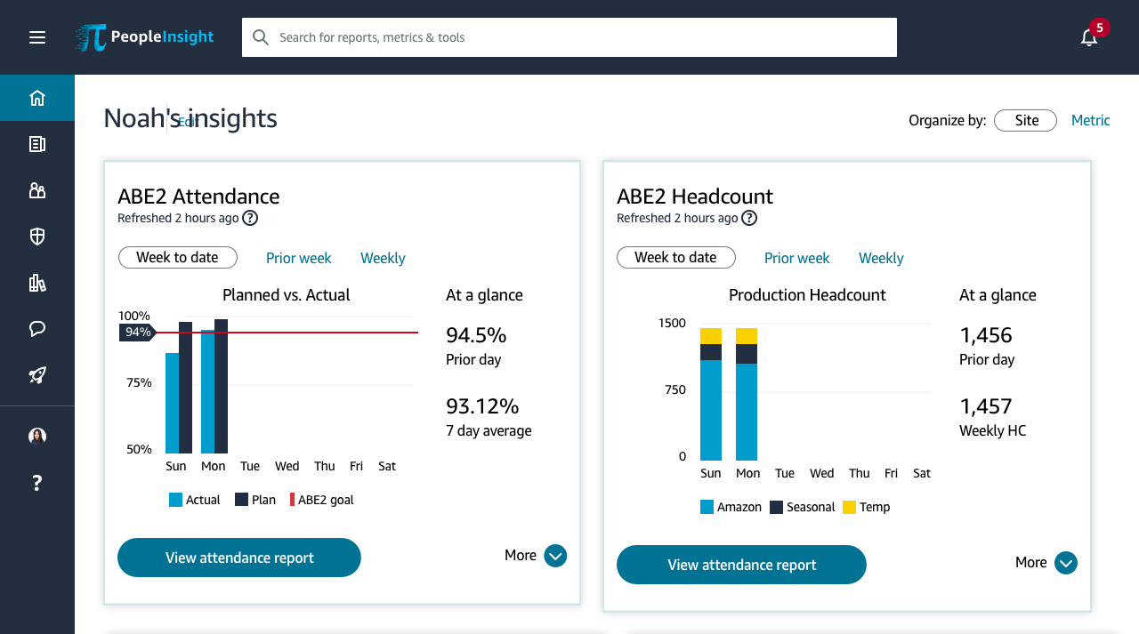
Designing the landing page experience
The job of the landing page was to give user a quick take on sites or business lines they care about. I already knew from my existing site research that the most important metrics leaders cared about were attendance, headcount, on premise, and attrition. I decided to start with the attendance metric because it was the easiest one for me to understand, being new to HR and logistics. I took the concept mock and began working directly with the product owner to iterate. Thankfully, the product owner came from HR Operations, so he was able to add helpful context to get me going quickly. I also set up virtual interviews each week to validate assumptions or bias i was worried about.
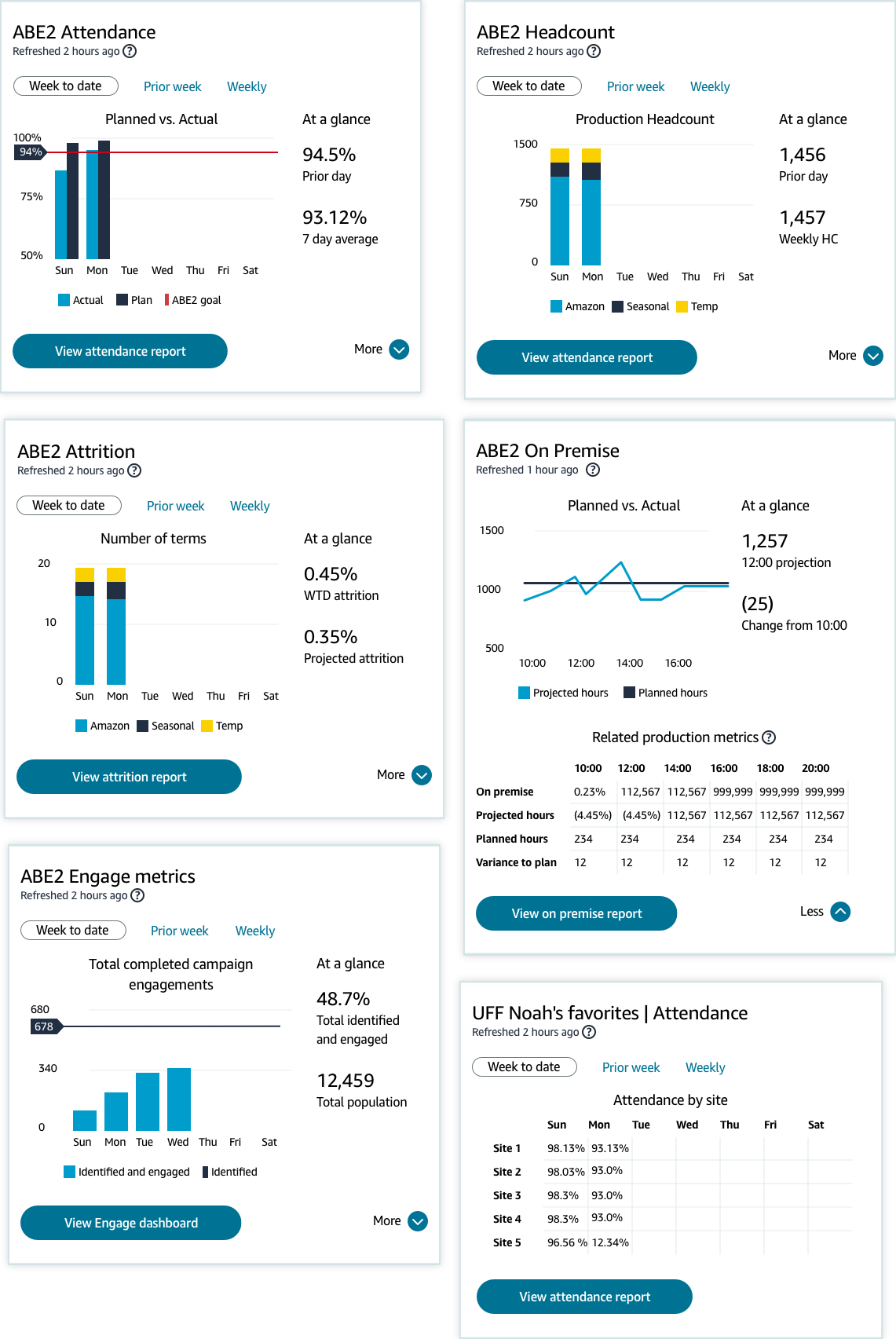
Step 1. Determine the most important metrics
Thanks to many, many site visits where I conducted interviews, did fly on the wall research, and shadowed operations leaders across the globe, the most important metrics were fairly easy to identify. Everyone always mentioned the same top four: attendance, headcount, on premise, and attrition. However, users don’t just look at one of those metrics by themselves - they look at a set of metrics that are often related to one another. To figure our the most relevant “related” metrics, I worked with the product manager on his best guess, then validated the lists with users. Once I had all four sets, I was ready to dig into designing the metric cards.
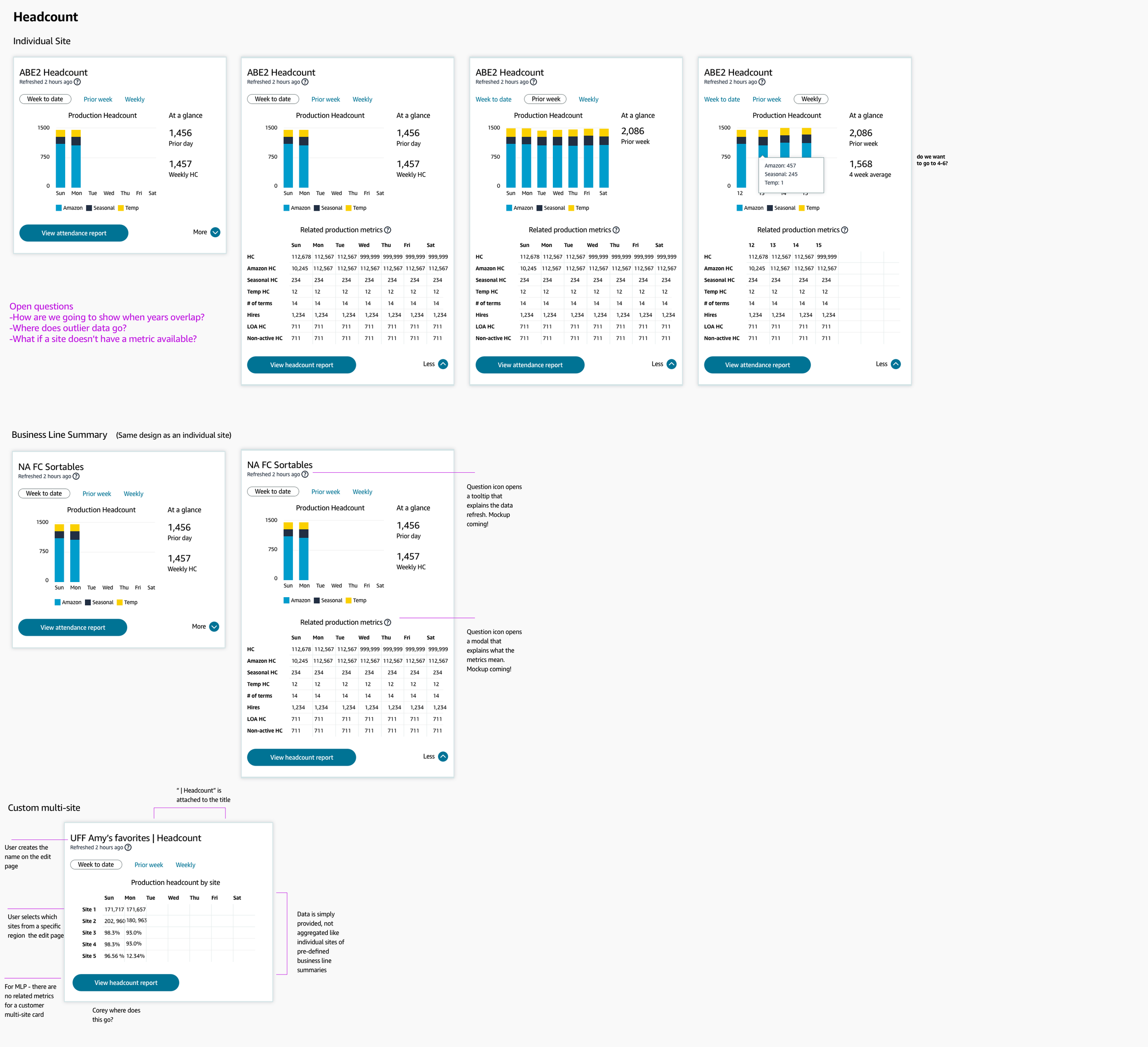
Step 2. Create a scalable design component
By the time the metrics were finalized, I had about 4 weeks to finalize the designs. Unfortunately, the design system we were using (Stencil) did not have any components that would help us with this, so we had to make something custom and it had to be scalable. I started by thinking about what the core components of a metrics card would be: a customizable name, a visual graph highlighting the main metric, supporting related metrics, and a primary CTA to help a user dive deeper in a a detailed report.
Step 3. Design graphs for each metric card
Once I had the new core component finalized, I got to work on figuring out which graph type would best portray the metric and corresponding data.
Step 4: Make everything work for the various populations
Lastly, I had to make sure the landing page would work for the various populations - single sites, regional sites, and custom sites.
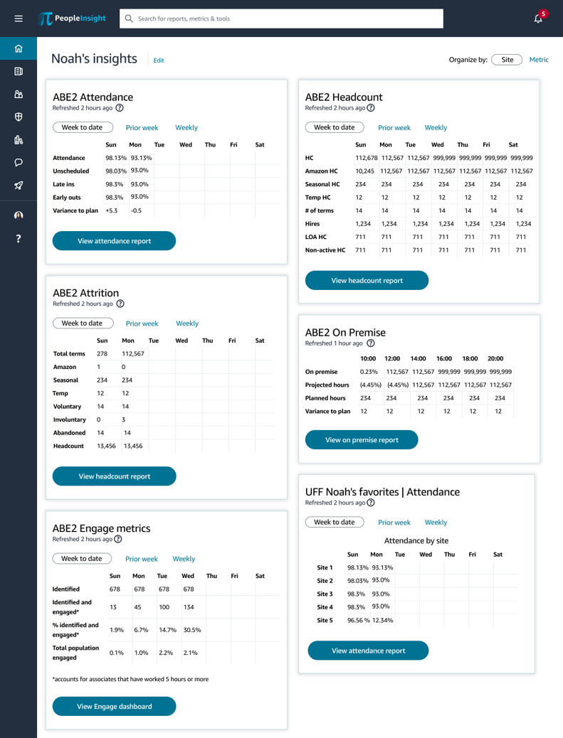
Step 5. Say goodbye to the graphs
During the development time, we had to strip back the experience for MLP in order to meet an immovable launch timline. There were two options - give all the widgets the same type of graph, or only display the metrics. It broke my little UX heart, but I chose the metrics. Graph’s do not work universally across data sets, and I wanted users to be able to have the data quickly - not confusingly. Having the job of the landing page already defined made this decision easy (even if it was sad).
Results
As of December 2020, Clarity has an average of ~5,000 active users per month and 18,167 unique users since launch, and users have collectively created 27,121 custom reports and 36,821 home page widgets to meet their unique needs. Customers also loved the product, noting: “This tool is amazing - I can create a report in 5 minutes that used to take me over an hour every day”.
After launch
While the launch garnered good feedback from customers, I knew there was a lot left to do. Channeling my insistence on a higher bar, I pulled product, tech, and UX leaders together into a full day roadmap planning workshop that I facilitated to develop next year’s set of product features. We eventually hired a principal product leader to oversee the prodcut, and I transitioned the work to him.
Lessons learned
Should have worked with engineering to see what the data would output as. They come from different sources so it's not as easy to clean up like I did in my specs.